Labrat Platform
Redesign
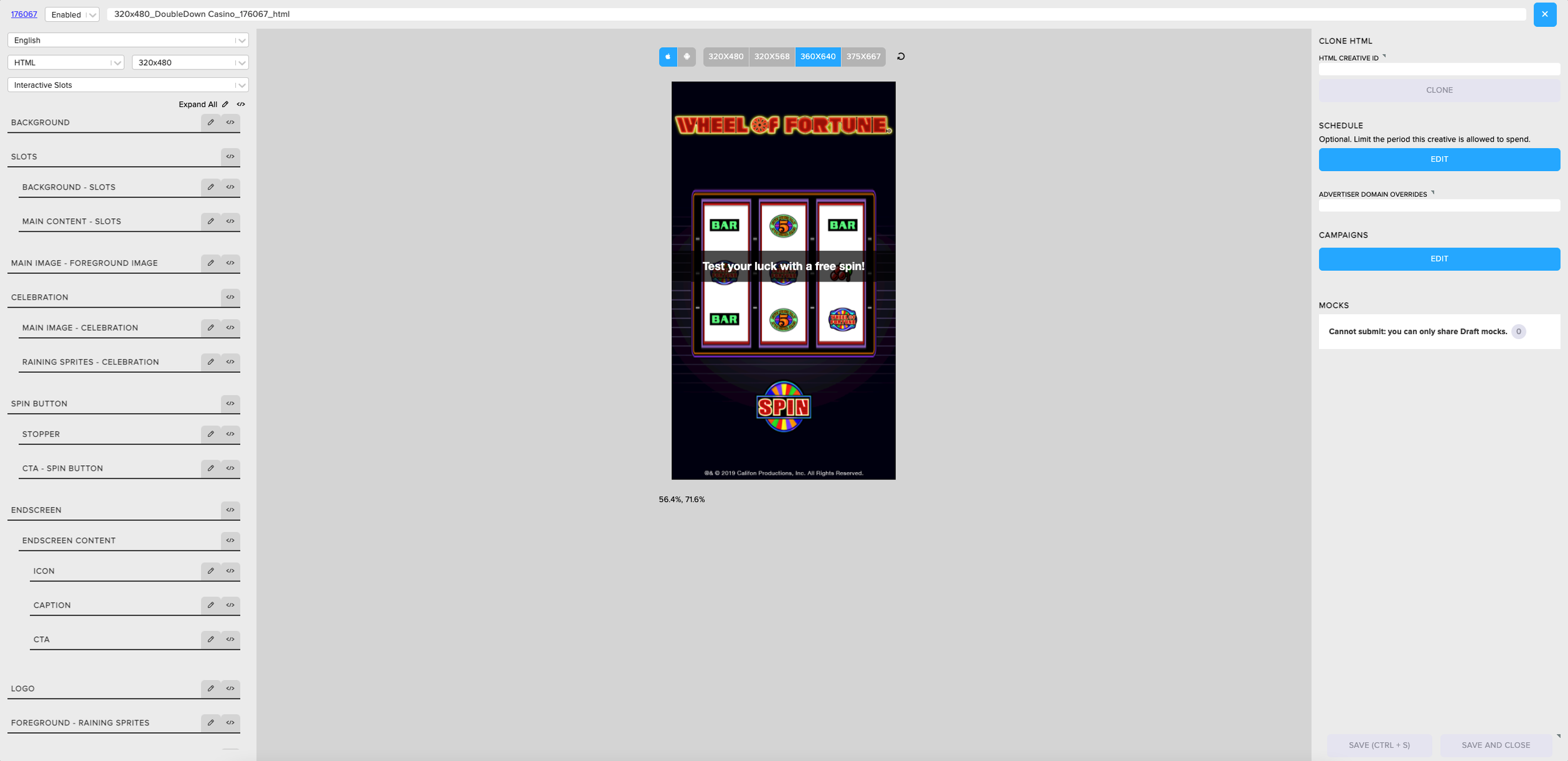
Labrat is a great internal platform used every day by our creative team here in the US, London, and Singapore. The functions are mobile ad creator, a/b tester, and creative manager. It has much flexibility when creating static, video, and interactive creatives. It works great, but it became hard to navigate once we started to add components and enhancements. It needed a redesign to categorize sections to better and simplify workflow.
Contributions: Concept Development, UI/UX, Design, Typography, Design approval, Research
DATE
Spring 2022
ROLE
Product Designer
CHANGES
New text hierarchy, color usage, new functionality
APPLICATIONS
APPROACH
Problem: We depend a lot on Labrat, but it was created by our engineering team with little input from the creative team at the time. Once we populated the platform with new functionality it became very cumbersome to find components, we lost our place when building creatives, production was unnecessarily slow, and physically it was straining to focus our eyes. We had meetings and took a survey on what we wanted to change and we reached a consensus that we needed to apply some design principles to the editor and functionality that wouldn’t clash with the new design elements.
Solution: Applying design principles for readability and legibility helped a lot. Figuring out how to not just show hierarchy and importance through text but also through shapes and colors.
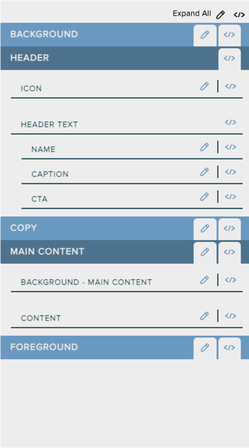
Alternating title bands will help with defining sections and compressing space for the whole menu.
Knocked-out text will add another dimension to the main sections’ names, standing out from the rest of the text.
Secondary section titles will have solid text treatment and slightly lighter text weight.
Editing tabs - When one tab is clicked on, the unused tab will reverse its color scheme and blend into the band.
Secondary editing tabs will be greyed out when not clicked on.
Colored dividing lines will still help with separating the tertiary sections but will not overpower those sections' titles. The line colors will match the main color of the title bands.
EDITOR MENU
QUOTES
“After being away from the platform for so long, I can still build creatives quickly without relearning too much!”
Global Head of Multimedia Production
WHERE WE STARTED
When I started at Liftoff, I focused on understanding how to use Labrat, the creative builder for our mobile ad clients. Our engineering team produced it with little input from the creative team. This was the case because the creative team wasn’t fully formed at this time. The engineering team was also tasked with building and launching our clients’ mobile ads.
Over time the process became more cumbersome. Our team made requests to add more functionality, which in turn added more components to the interface. Certain fields became harder to find and workflows became more complicated.
Instead of scaling back our additions, I decided to finally update the look of the interface so our team could work more efficiently.
PLAN OF ATTACK
First, I wanted to primarily focus on the editor which is on the far left. That is the section that the creative team works from the most. When we wanted to design, make changes, or edit a creative, we would have to reference the editor for every change. This was also the section that needed the most design help.
RESEARCH & EXPLORATION
Initially, when I started I looked at the structure and functionality of the editor. I wanted to introduce a band system similar to Excel. That way users can decipher the main components from the supplementary ones. Then I would implement text sizes to show importance and a down carrot to show that a band has a drop-down section.
I wanted to see how the reverse text looked when utilized against different shades of grey, but it became too repetitive.
Since each band technically is a drop-down, I would later get rid of the carrot and all-over reverse text.
INTRODUCING COLORS
For color inspiration, I noticed that my Bear note-taking app has several color themes and one stood out. I liked how the blue was a calming color and there was a mix of the reverse and traditional text treatment. The different hues of blue were utilized with different text weights to show hierarchy.
Here, I wanted to assign color to the different components of the application; the divider lines, the category bands, the tabs, the hover states, etc. When I was able to share the beta with my team members, they had some great insight to inform me to scale back the color usage.
The structural changes I made did help with the layout by shorting the real estate for the text. The banding helped with no longer needing extra space to differentiate from the secondary text.
SCALING BACK & REFINING
Simplifying the color scheme made sense, the last thing I wanted to do was make the editor even more busy. We went from a muted blue, green, rust, and red scheme to a more neutral and chromatic blues.
Once we were in a good place with color, we had issues with the tabs. They were repetitive and drew too much attention. I thought it would be advantageous to have the unselected tabs “fade” into the background.
In the primary band, when the edit tool is selected the script tool will take on the same color of the band.
The same can be said for the secondary tabs. The selected tab will be highlighted while the unused one will be a faded grey.
CONCLUSION
This redesign was what the team needed. Not only did it help with making the editor more legible it also saved space while adding functionality. You can see that the platform’s new editor is about 20-25% shorter than the old editor while it has all of the same components.
Plus, this change helped with increasing team efficiency by 40% and team growth by 150%.
Emoji Library
Through the redesign process, the engineer and I decided to add an emoji library to all the text fields on the platform. This is a great way to facilitate a conversation between our clients and their users. Plus, it helps modernize our creatives.
When we a/b tested this addition, we did see significant improvement when using emojis with our text.
Contributions: concept development, UI/UX, user workflow, design, typography, design approval


